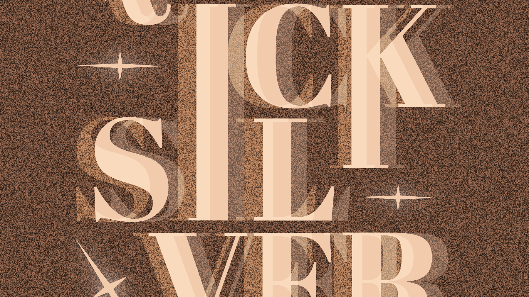
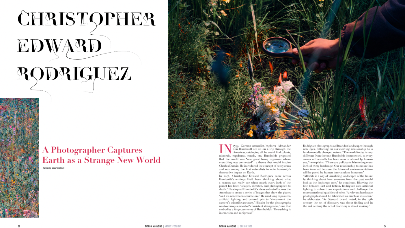
I was asked to mix characteristics from two typefaces to create two different faces. The typefaces I was assigned were Garamond and Arbotek. I named my final typefaces Lunate and Ashler. Lunate favors Garamond while Ashler favors Arbotek. Finding the perfect blend of both typefaces was a fun but challenging task. My biggest challenge was in finding a way to infuse Garamond with Arbotek. Ultimately, I was able to find a creative solution to this problem by extending and adding serifs to Lunate and incorporating the chip of the A in Garamond. Lunate and Ashler's characteristics are both experimental in the way that they exaggerate the characteristics of the original typefaces. Lunate's Serifs are more geometric and the width of the letterforms are a lot thicker. Lastly, Lunate can be used as a Display typeface similar to Arbotek. In this solution, Ashler becomes softer with rounded corners and the letterforms are wider. The counters are smaller in width and on a slanted axis similar to the O in Garamond. Additionally, they emulate the serifs of Garamond in the counter forms while exaggerating the blunt ends of the serifs.